The ArchVIZ BIZ – Starting a Studio : The Art
Yesterday we kickstarted a 5 parts series about The ArchVIZ BIZ by Norm Li. Read the introduction on the Job Board Blog to get a sense of what is coming… it’s GOOD! I’ve been keeping an eye on Norm Li’s studio since I started out 15 years ago and seeing how they grew to become the biggest independent ArchVIZ Studio in Canada is amazing. Lot’s of insight coming your way – brace yourself!
The genesis of any ArchVIZ Studio is mastering the product (art) and the production (technology). Whether you are a freelancer or a world class studio, you need to master these two competencies. I’m often asked which one comes first. That’s like asking whether the chicken or the egg came first.
Advances in technology enable better art. The pursuit of better art demands improved technology.
The Art
Look, no one starts out being as good as guys and studios like Peter Guthrie, Ronen Bekerman, MIR, DBox, Visualization One, Brick, or any of the other world-class artists and studios in our industry. It’s something you work on. And keep on working on all the time!
You’ll be happy to learn that there are some fundamentals that make life a whole lot easier if you know about them from the get-go.
Treat your work as art.
If all you are trying to achieve is a photo-real representation of a proposed building or space, it’s not art – it’s just a technical illustration. A simulation if you like.
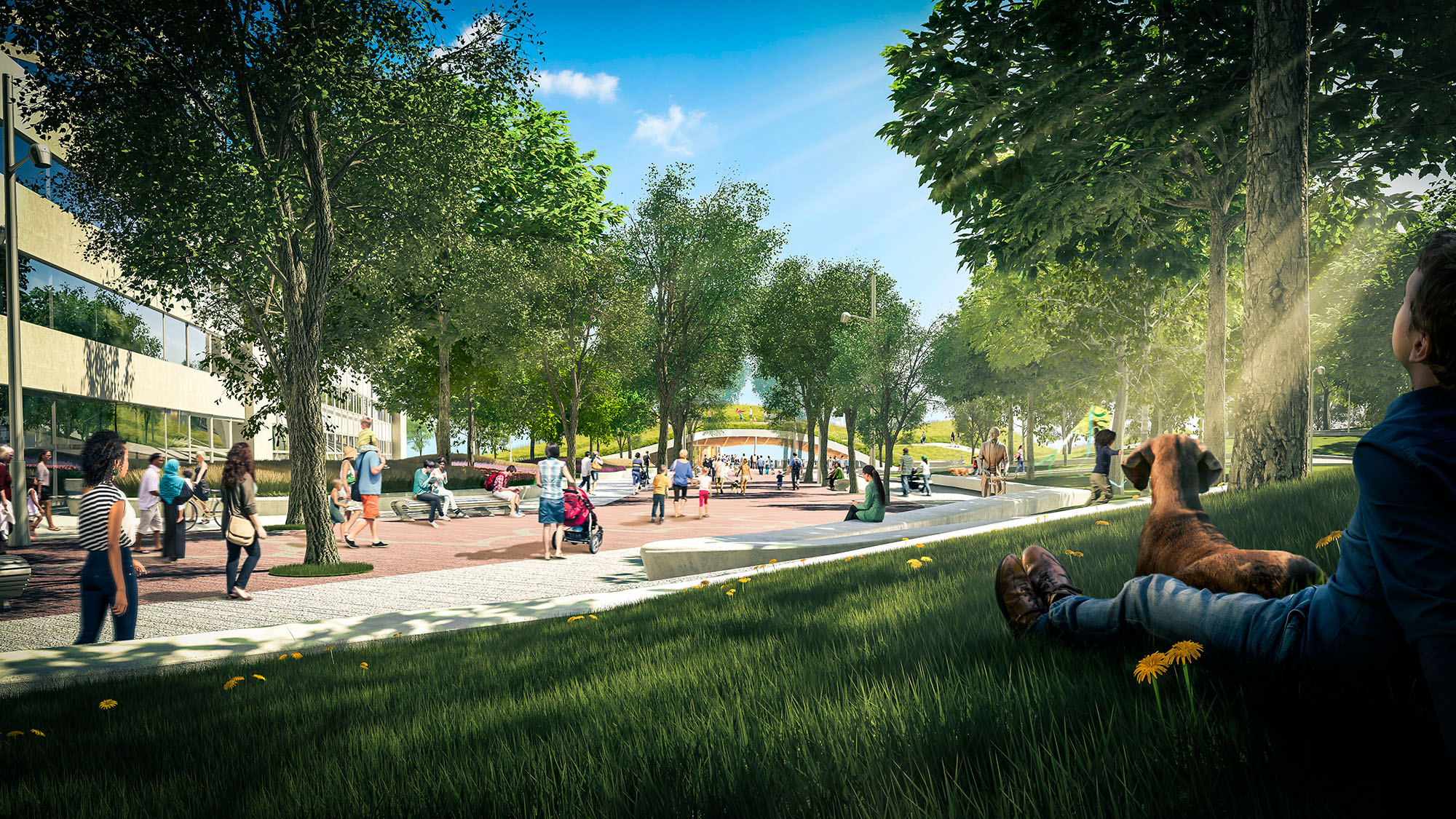
To rank among the best, your must create works of art. You need to tell a story about the subject that is compelling. Describing it with scientific accuracy is not enough. You need to make people want whatever it is that you are illustrating. Make them lust after that condo or grab a good coffee at the hotel lounge. Make them feel like they already work in that office, or relax in that lobby lounge.
Make them believe!
Transport them in their minds directly into the rendering.
So… how can you create art more easily?
Find Inspiration
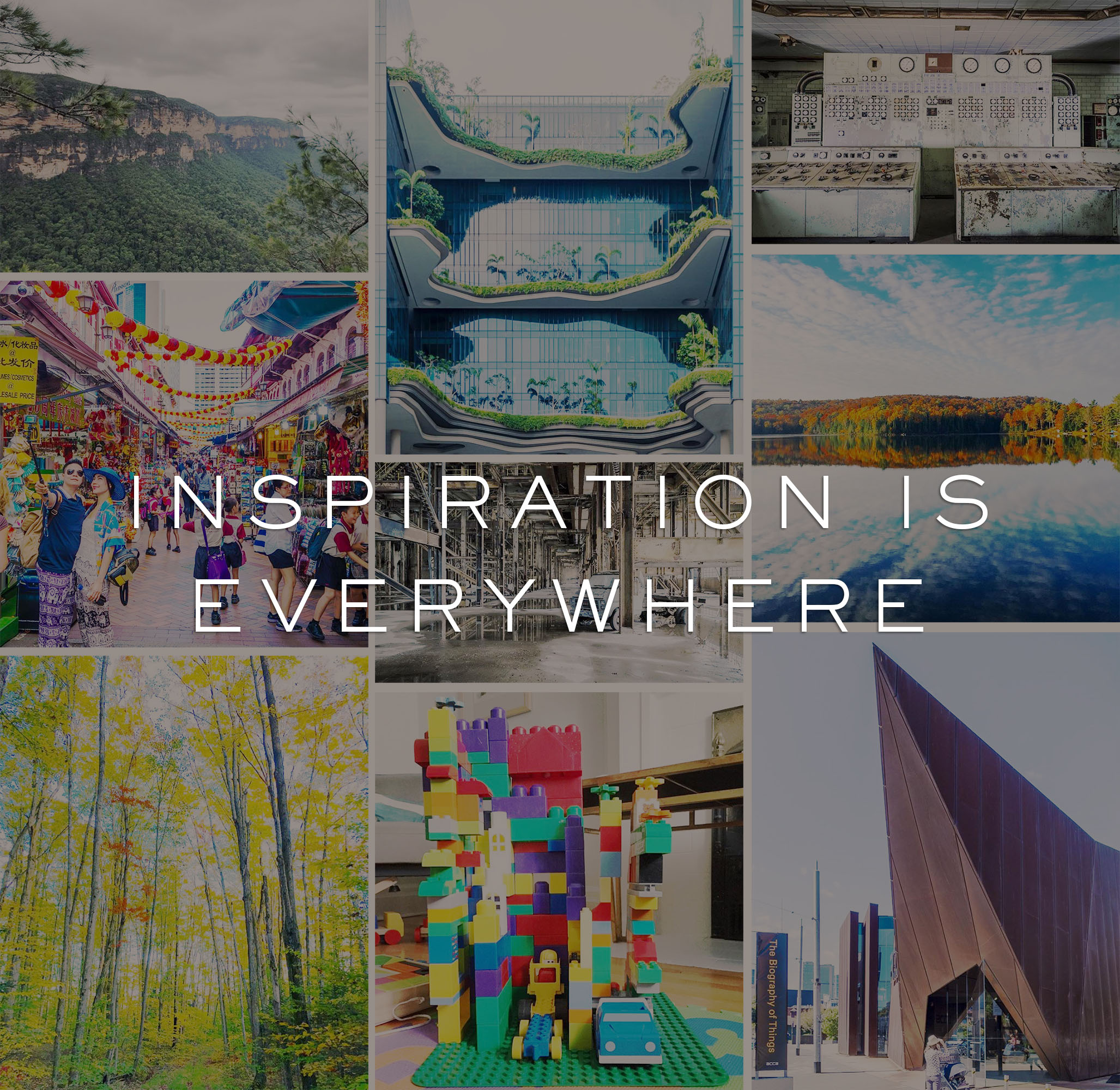
It’s totally OK to base your rendering on an existing image. All great images are born from an artist’s collective memories and experiences. It makes it much easier if you have a record of them. Start collecting images that you like.
The HOW is not important, just that you DO!
Save them to your hard drive or use Pinterest (Check out Ronen’s Pinterest Board to see how he does it), just have a system that works in terms of searching the collection once you need to be inspired.
In our studio, we make sure that we collect both rendered and real inspiration images. If our ultimate goal is to recreate reality, we should reference reality. Our studio directors search out the most captivating photographs and use them as templates for our images. Some of our favorite architectural photographers include Doublespace Photo, Tom Arban, and Iwan Baan.
Take your own photos too!
Taking advantage of your physical surroundings is also a great way to get inspired. We love going off-site to seek out real-world material and detail examples. Our entourage team is never without a camera, as they often take photos of subject matters as a means to experiment and see how it’s captured in real life.
The more life-like your image looks, the more probability it has with making an emotional connection with your audience.
Write the Story
In our studio, we ask the 5 W’s before we begin any image : Who, What, When , Where, and most importantly, Why?
Answering these questions helps us establish a plan that will help focus the execution of an illustration.
Who :
Who is the intended audience?
An image for marketing purposes should be very different from an image being prepared for legal purposes such as a civic design review. If it’s an image for a fundraising campaign, it should speak to the donors. If you’re preparing a set of images for a particular city, make sure the people in your entourage reflect its’ demographics.
Here in Toronto, we have a very diverse population, so including a broad range of ethnic groups for local projects allow us to create a more realistic image. When we’re working in large American cities like New York or Los Angeles, we are mindful to incorporate high levels of African American and Latino entourage.
By including your viewer in the image, you make it easier for them to connect with it.
What :
What is the main subject?
Is it the building? Or perhaps the image is part of a set and focuses on a specific sub-area such as a park or a plaza. Or maybe it’s about a specific space within a larger open area.
Your answer will help you determine where to place the bulk of your energy when detailing the model. By directing your effort toward a certain area, you give the image focal point and also increase the efficiency with which you can produce the image.
When :
Determine the most appropriate time of day and season. Not every building needs to be shown at dusk!
We once had a client insist that we depict an elementary school at dusk. It made no sense at all and in the end, the image wasn’t very successful. Another tactic is to see if there is a particular event that happens at a special time that will really compliment the space or building.
Here in Canada, there are often winter festivals that happen in and around our civic buildings; depicting the buildings in a snowy winter atmosphere really enhances the “Canadian” locality of the project. It’s also important however to note when the images are intended to launch. Although winter scenes are cool – if you’re launching a project in the middle of the summer it might not make the most sense.
Where :
Where is the project? You might think this is a no brainer, but you have no idea how wrong some artists and studios get this.
Whenever we get an assignment, we visit the site. If it’s local, we head out there whenever possible. If it’s an international site, we look up the site on Google Earth and do a virtual site tour. We note the types of vegetation, models of vehicles, street accessories, traffic signals, etc.
I’m always shocked when I see images for local Canadian projects that have foreign license plates and subtropical vegetation. If those studios cared to do the most minimal of an investigation, they would know instantly how ridiculous all that is.
It’s not just how you render the building or space that makes an image sing. An image is the sum total of all the details that are incorporated into it. In order for the image to make sense, all the entourage and detailing must make sense as well. Your minds eye will instantly pick up on any oddities; even if you can’t quite put your finger on what exactly is wrong, you’ll just feel it instinctively.
Why :
This is the question that ties it all together.
Why are we building this project? What is its’ reason for being? Is it to enhance the neighbourhood? Is it to bring a whole new way of living to the residential market? Is it a culmination of a masterplan for a university or corporate campus? Why does it exist?
Your image should clearly communicate the project’s reason for being.
If you can answer these 5 questions clearly, your image will deliver its message with precision and impact. If not, the image will likely provoke more questions than it answers.
Use Analog Rules in a Digital World
Even though we can do all kinds of crazy things on a computer, it doesn’t mean we should. Our studio often gets files from our clients that have cameras set at 6mm, with the sun coming from the north, and lights with values that are well beyond physics. We are often asked to shoot views that only birds and drones can see.
Keep it real. Keep it simple.
Remember, you want to tell the story of how a real person will experience a project.
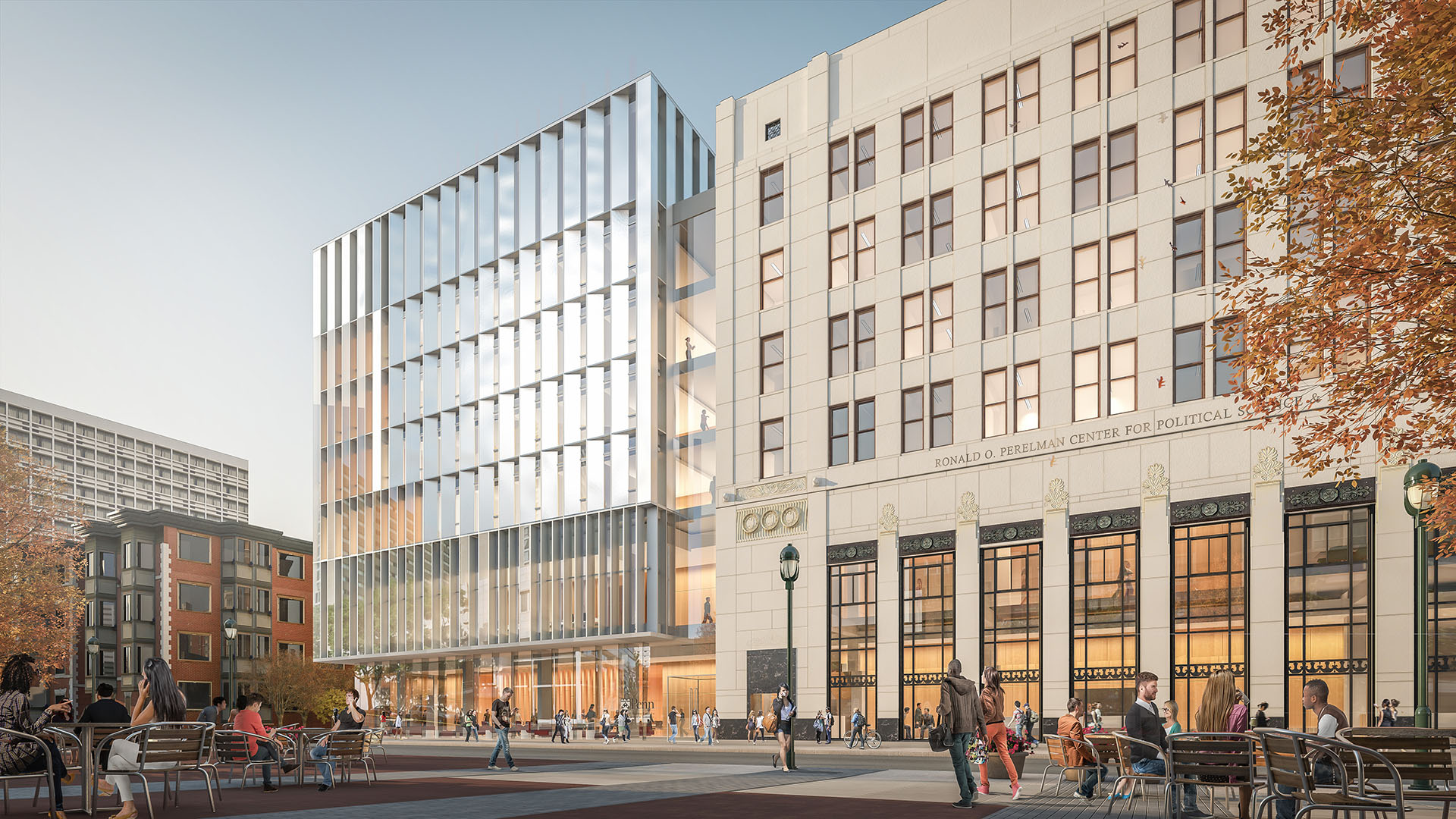
I also suggest employing time tested artistic principles like the rule of thirds, the golden rectangle, the rule of odds, color theory, etc.
See Compositional Theories of Art for a visual guide to the various rules of composition.
I also like to obey physics. And most of all, don’t go overboard with the likes of bloom, volumetric lighting, chromatic aberration and excessive depth of field play. Stick to the story of the image and what serves it well.
Use Photoshop Appropriately
Photoshop is this wonderfully double-edged sword. When used to enhance an already great image, it can really take an image to the next level. However, our team believes that if you come to depend on Photoshop to overcome shortcomings in your ability to produce a decent rendering, it can make things a whole lot worse.
A wise man once said “a pig with lipstick on is still a pig.” Here at Norm Li, we try as much as possible to get it right in the base rendering. However, there are people who expertly defy this rule. The guys over at SOA are a great example. But they have also built a process that allows for it.
In our studio, we live in a fast paced, design driven environment. We participate in a lot of design competitions and at the very early stages of projects. We don’t always have the same ability to lock down the parameters of our images. As a result, we try to involve as little post production in our images as possible.
End of Starting a Studio : The Art
Whether you’re one person in your mom’s basement (like I used to be) or 100 in an office tower in Manhattan, your mastery of art will play a huge factor in your success.
Arch Viz artists and studios live and die by their last image. Failure to keep up with the times can tank an otherwise successful studio. No matter how great your clients tell you your images are, remember that when it comes to art, you can never stop learning and evolving.
Remind yourself daily that we are, first and foremost, artists.
See you in Part 2 – Starting a Studio : The Technology
Norm Li.
The ArchVIZ BIZ by Norm Li - Introdution
Part 1 - Starting a Studio : Art
Part 2 - Starting a Studio : Technology
Part 3 - Growing a Studio : Culture
Part 4 - Growing a Studio : Finance
Part 5 - Growing a Studio : Client Management






(y) (y) (y)
Love this, great inspirational content, we are and always will be artists first! Looking forward to next part!
I agree to everything you say about the
art in our work and your creative suggestions and advise. The problem we experience
every day in our studio is that we don’t get or have enough time for creative
meetings is it at the beginning or during the process. We do try to have studio
lunches with work reviews so we can look at other people’s art work and
examples and in order for us to reflect
on our work, but mostly we get overruled by client’s needs.
We get hardly time for the needed production,
although we let our clients know the estimated time frame. One reason why our
profession is so fast driven is that also our clients are under stress with
short deadlines set by their clients. T3DS is lucky to have a small team of the
best visualizers and to have a Creative Director, Jared Foley, who also
optimized our work flow and technical needs to the maximum in order for us to
produce high quality renderings in extremely short time frames. Sometimes we
only have 2 days for complicated full
blown office space renderings or retail renderings. On the average we have 30
running projects per month and most of them are “on call” by the client. We work
with the largest architectural firms in the world and sometimes it’s just brutal
and sweat work. I admire our team members about their passion, enthusiasm, incredible
artistic and technical skills and hat we still can meet and exceed our clients
expectations and demands so well under such stressful conditions.
All the images you show in your article
are beautiful and fit perfectly to your artistic description and outline in your
article but we need to tell your audience also that mostly: you won’t’ have a lot
of time to produce the requested work, you won’t’ get much time to learn on the
job and experiment and if you have to make a living of doing arch viz
renderings. Clients and the viewers of our work have almost no patience nor much understanding what’s involved to be a great viz artist, nor do they know the
background of how and under what conditions the work was created. So, be sure and
ready that your work will be very critically reviewed but compared to the best
work seen online and then probably judged unfair.
I am happy to say that we at T3DS found a
middle way on how to combine, generating income, to keep our clients
happy with meeting their sometimes almost ridiculous short time frames but demanding the highest quality with producing art and integrating “art” in our daily work.
Tangram3DS Hi Stefan! … I hear ya buddy … We were in the exact same place 2-3 years ago … we were faced with constant rush deadlines, impossible requests, and demanding clients who had no money to spend … it takes a lot of will power and a major shift in mindset, but it can be done … I wouldn’t even say are all the way there yet, but we have taken great strides … Your clients don’t necessarily know that they are putting such massive pressure on you … if we allow our clients to act a certain way, they will come to accept it as normal … it is up to us as an industry to set standards and educate our audience! … parts 3,4 and 5 will be of particular interest to you … again – I know it’s tough to wait for all these parts to come out, but if Ronen and I had published this as one go, it would have taken up a LOT of screen space … Thanks for sharing your perspective and experience – clearly we are all facing the same challenges … There is hope though and definitely a way out …
I’m very interested in this topic, and look forward to the parts relevant to managing client expectations 😉
Tangram3DS I totally agree with you guys in terms of not being able to have much time to execute projects . It happens all the time with commercial projects . I guess there’s always a silver lining in everything , if an artist is really passionate about what he/she is doing, an hour a day after working hours would be great to work on personal projects in order to keep the passion burning .
Norm/Stefan we aren’t as big as you guys but all same issues. Been at it since 2001 as well, and it’s hard to change the clients thinking. Sometimes we are our own worst enemies being artists at heart.
Quinn
Thank you very much! we really love it! 🙂 go to the next part.
Really great work! a truly mindopener. I will be reading…
Great article.
I am looking forward to the next ones, I hope that they are more geared towards actually running a studio rather than how to create renders.
The next article will be about technology as it relates to the setting up of a shop and the last 3 parts will likely be what you’re after as they are on culture, finance and client management
Hey Ronen, when can we expect the next part?
Nice visualization Works… i Have Started 3D Rendering works. http://www.thecheesyanimation.com/
hoppergrass part 2 – The Technology is live 😉 http://www.ronenbekerman.com/archviz-biz-norm-li-technology/
Yep yep yep! We have tried to adopt the experiential approach as much as possible. Place them in the space emotionally, rather than technically by giving a taste of the experience of being there. We’ve been creating pre-rendered 360 VR animations as well which can really kick things up a notch depending on the space and the audience of course. Unreal Engine stuff as well, though it’s much tougher to distribute so that’s reserved for only very specific uses. Keeping up with these new trends while increasing quality, skill sets etc. is so important and so very challenging.
On the Art side as Stefan mentions it is very difficult to balance client needs with the need to develop internally. To be honest the best work I’ve personally created has always been during project droughts. Suddenly the phone stops ringing for a bit and rather than take a breath or some vacation days we’ve used it to bust out personal projects with the focus on boosting our quality, range of capability etc. That worked ok as 2 artist, but as we are growing now it’s been trickier than I expected to keep us all growing as artists.
As of late I have been working toward shifting our workflow to be more realistic and artist friendly as you can only pull 18 hour as days for so long and so often before people burn out, quality drops etc, not to mention the health ramifications which should not be ignored. That means telling clients the hard truth that sometimes their crazy requests are actually crazy. I’m learning setting reasonable boundaries is essential for the sake of the team. I have become unwilling to assume my employees (myself included) can always work weekends if needed, not go home in the evening etc. Sure it is needed at times, but I can’t let it be the default. Thankfully I have yet to receive a truly negative response when setting these boundaries other than disappointment that we can’t help them out at this time or that expanding the scope the day before delivery isn’t reasonable etc. Sometimes they can adjust things to make it work and sometimes they can’t. It’s a work in progress for sure. I see in your comments this is something you’ve focused thought and energy on so looking forward to reading your thoughts on this!
On the inspiration side we use Behance.net as a way to expose ourselves to all sorts of art we would otherwise not lay eyes on. There’s some amazing work to be found in all mediums, CG, photography, Film, illustration, painting, VFX etc. stashmedia.tv is another awesome resource for finding great curated ad, mograph, film, animation work etc. We do this independently but have a common wall mounted screen we can all see from our workstations that we throw up an image or animation etc to share. Also understanding where you’re own work falls on the spectrum of quality out there.
I see the next part is up so I have my lunchtime reading locked in! Thanks!
part 3 is out http://jobs.ronenbekerman.com/the-archviz-biz-by-norm-li-culture/
part 3 is live http://jobs.ronenbekerman.com/the-archviz-biz-by-norm-li-culture/
http://viendaotaoxaydung.edu.vn/lop-chi-huy-truong.html
học chỉ huy trưởng công trình
http://viendaotaoxaydung.edu.vn/hoc-lap-du-toan.html
học lập dự toán
http://viendaotaoxaydung.edu.vn/hoc-quan-ly-phong-thi-nghiem.html
học quản lý phòng thí nghiệm
http://viendaotaoxaydung.edu.vn/hoc-thi-nghiem-vien.html
học thí nghiệm viên
http://viendaotaoxaydung.edu.vn/hoc-so-cap-nghe.html
học sơ cấp nghề
I feel very related when the article mentions that trying to achiev real life images tru rendering and post-prodution is not art and it makes me feel so angry.
I’ve been trying to explain my boss that the dreamie look, the art in creating something unique and magical in every Job we have will sell as good or even better that trying to achiev real life photography. It doesnt fit…the lack of some fantasy, that magical touch, the dust particles, and some other stuff that keeps evolving on my head every time i do a work for a client and i just can’t work on it because the boss is the boss….
Ps: THe articles missed a very important name “Alex Roman” should always pop up ..i really admire very much his work!!
http://viendaotaoxaydung.edu.vn/lop-hoc-chung-chi-thi-nghiem-vien-a151.html xây dựng , học http://viendaotaoxaydung.edu.vn/hoc-quan-ly-phong-thi-nghiem-a152.html , học http://viendaotaoxaydung.edu.vn/chung-chi-phong-chay-chua-chay-a164.html , http://viendaotaoxaydung.edu.vn/hoc-quan-ly-du-an.html xây dựng , http://viendaotaoxaydung.edu.vn/lop-chi-huy-truong.html công trình , http://viendaotaoxaydung.edu.vn/hoc-lap-du-toan.html xây dựng